It’s our first day using the debugger! I love debuggers so much. I feel like teaching how to use real debuggers is undervalued by the developer community.
Day 51, officially over half-way done with #100DaysOfSwiftUI!
Continuing our new project in Day 50 by using CodingKeys to make @Observable get along with JSONEncoder().encode(), and learning about haptics with the .sensoryFeedback() modifier and CHHapticEngine. #100DaysOfSwiftUI
New project day! Day 49 was focused on async/await, URLSession.shared.data(), AsyncImage, and the .disabled() modifier. I’m continuing to use TabView so I can keep all the sample code around in a project. #100DaysOfSwiftUI
Day 48 included watching two videos. Paul’s had a fun premise (“What Star Wars Can Teach Us About Swift”) and Woz’s video seemed aimed at high-schoolers, but had some good takeaways: “make your studies… a fun part of life” and “always try to be creative and think different.” #100DaysOfSwiftUI
Day 47 was a review and challenge day, with an entire app we had to build from scratch on our own. I’m stoked it only took me 30 minutes to put together this app! #100DaysOfSwiftUI
Day 46 was a review quiz and a challenge!
Today is the first day I’ve run into this error (that I’ve seen so many SwiftUI developers complain about):
The compiler is unable to type-check this expression in reasonable time; try breaking up the expression into distinct sub-expressions
Does that make me a real SwiftUI dev now? #100DaysOfSwiftUI
Adding a tab bar wasn’t part of Day 45, but I wanted to keep my other view and start “fresh” with today’s code. We actually went through navigationBarTitleDisplayMode(), toolbarBackground(), toolbarColorScheme(), toolbar(), ToolbarItem, and passing bindings to navigationTitle(). #100DaysOfSwiftUI
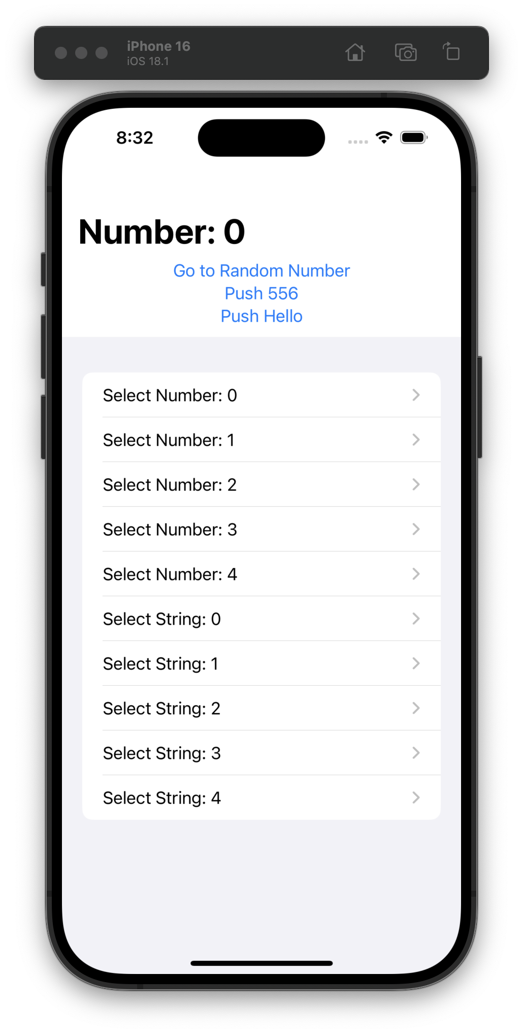
For Day 44 I made this abomination while learning the ins and outs of NavigationPath. #100DaysOfSwiftUI
I had been wondering about how to only load detail views when they’re navigated to, and in Day 43 I got my answer! Hello navigationDestination(for:destination:) 👋 #100DaysOfSwiftUI
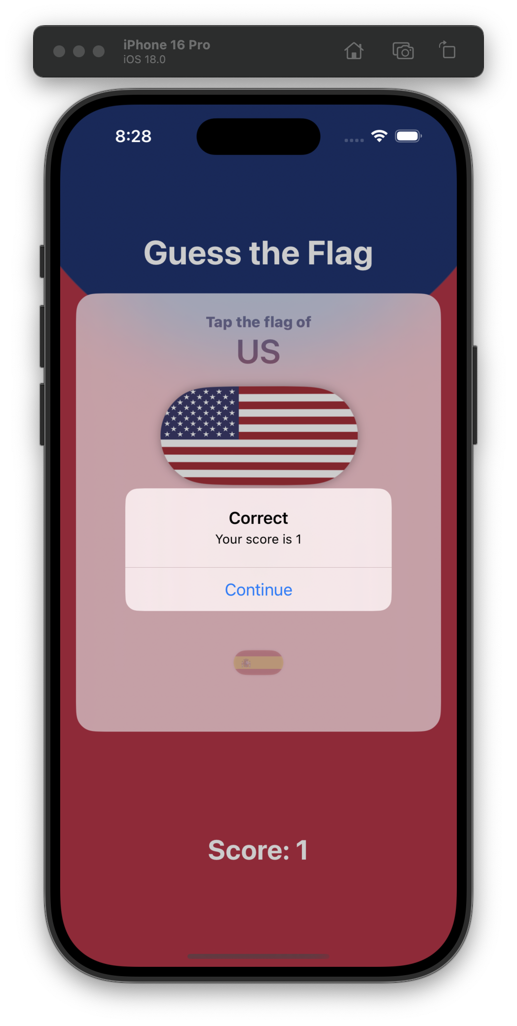
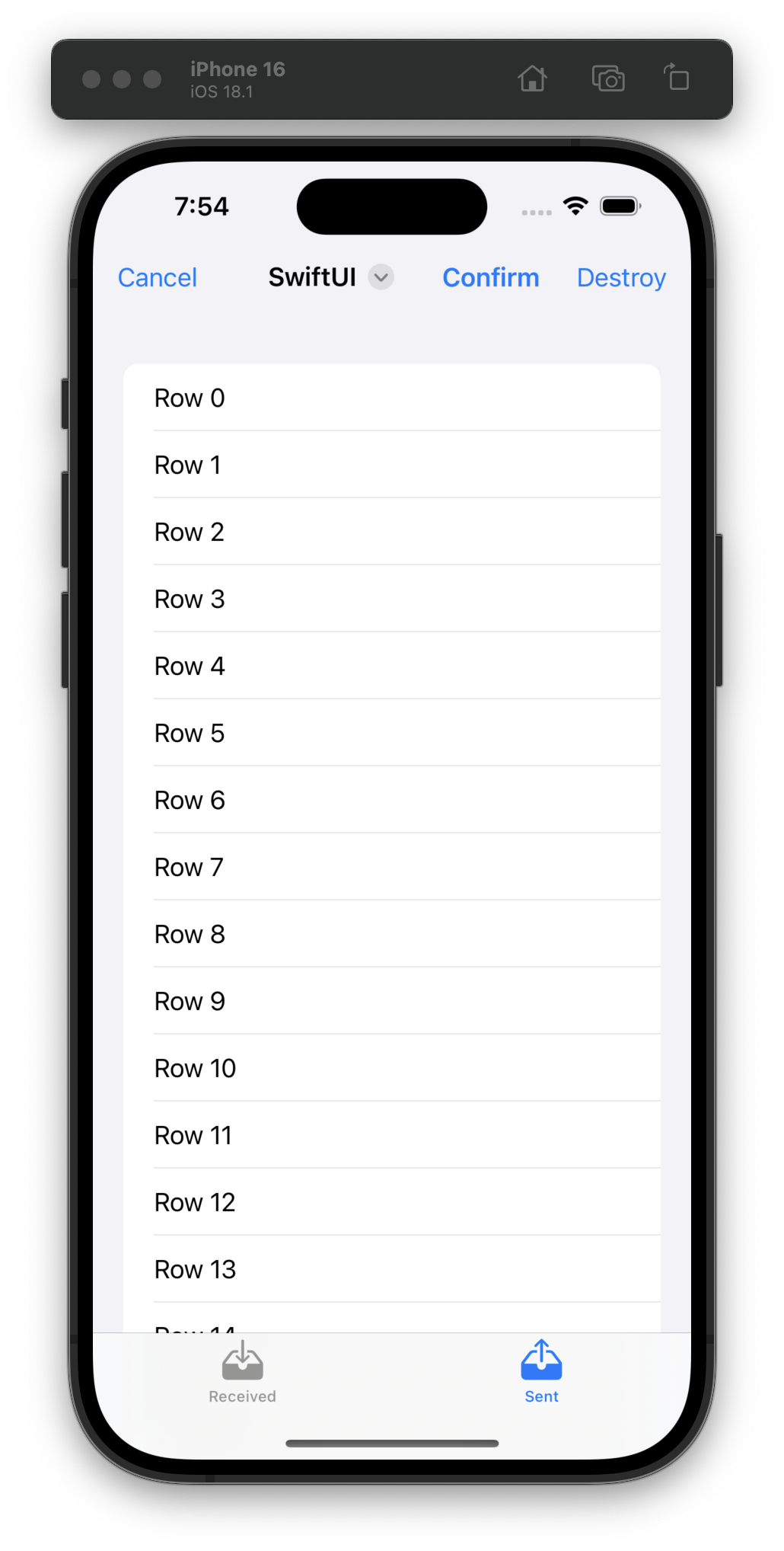
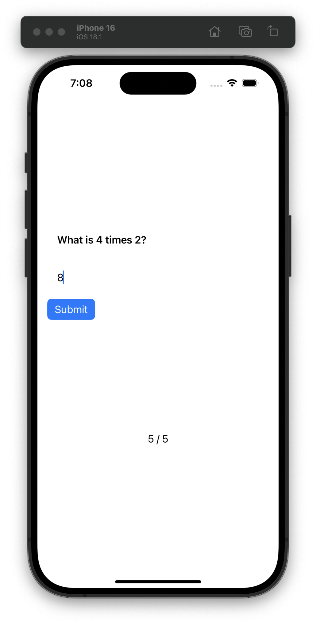
Day 42 (hey!) is a challenge day and I am taking it easy with just a refactoring of some views and not adding a brand new list view (with a toggle between it and the grid view). 🇺🇸 #100DaysOfSwiftUI
Day 41 was our last day of adding pre-made #100DaysOfSwiftUI code to this Moonshot project. Tomorrow, challenge!
I really appreciate Xcode’s previews. It reminds me of the love I professed for demo files in my CSS-Tricks “modlets” article years ago.
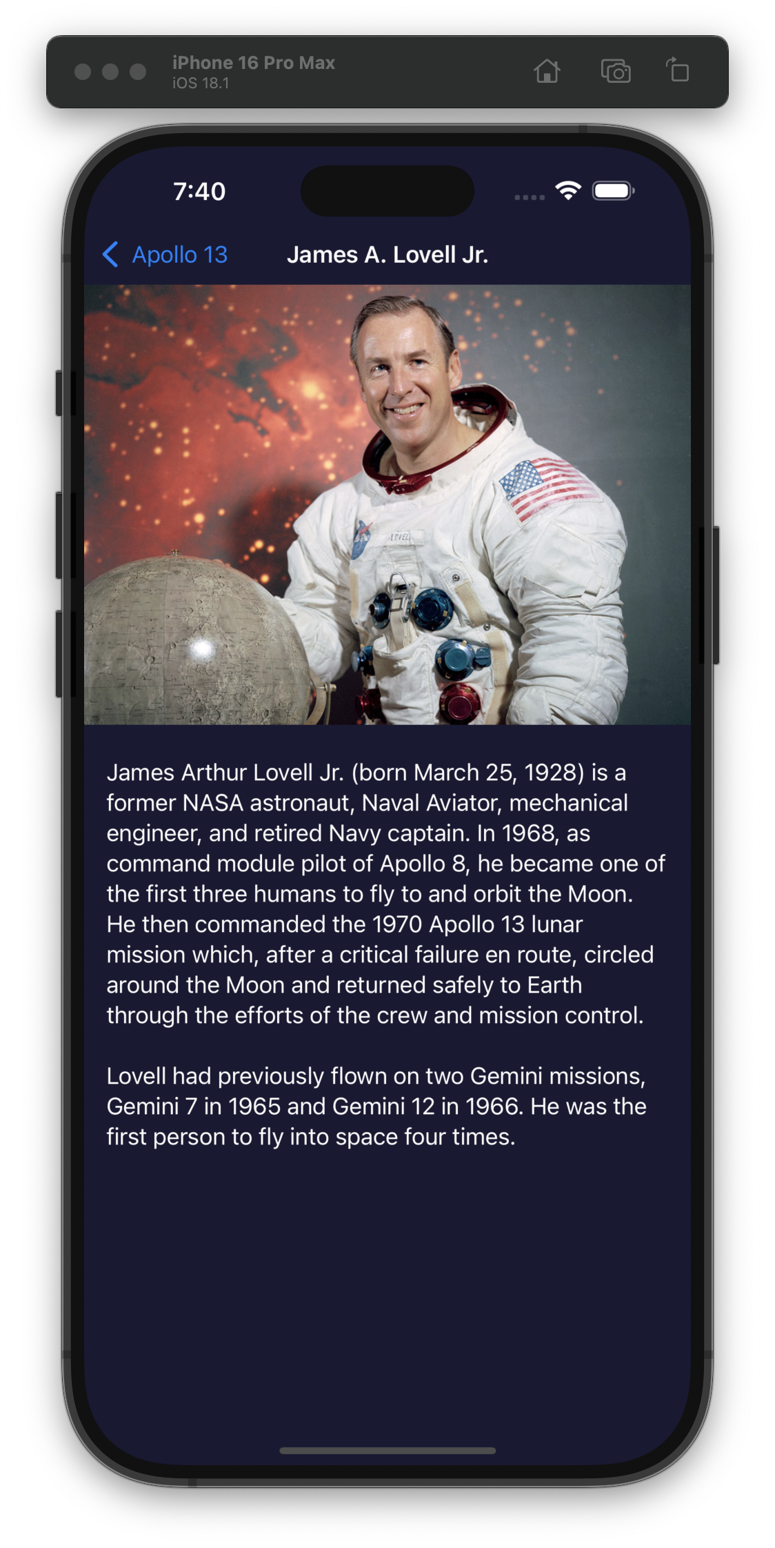
For Day 40 we put into practice what we learned yesterday by starting the implementation of the Moonshot app. Pretty cool that #100DaysOfSwiftUI provides sample data and images to build more interesting-looking apps like this one.
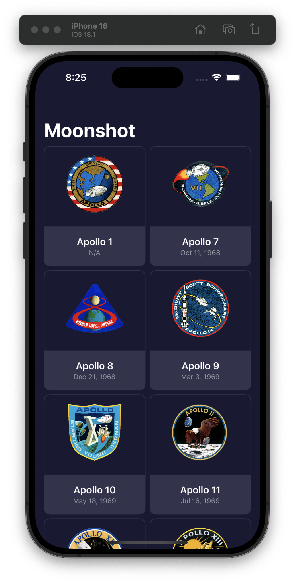
We’re starting a new “Moonshot” project for Day 39 and learning about Image resizing, LazyVStack, LazyHStack, LazyVGrid, LazyHGrid, NavigationLink, and decoding hierarchical data with Codable.
I wonder about learning optimizations like the Lazy versions of Stack/Grid so early on. #100DaysOfSwiftUI
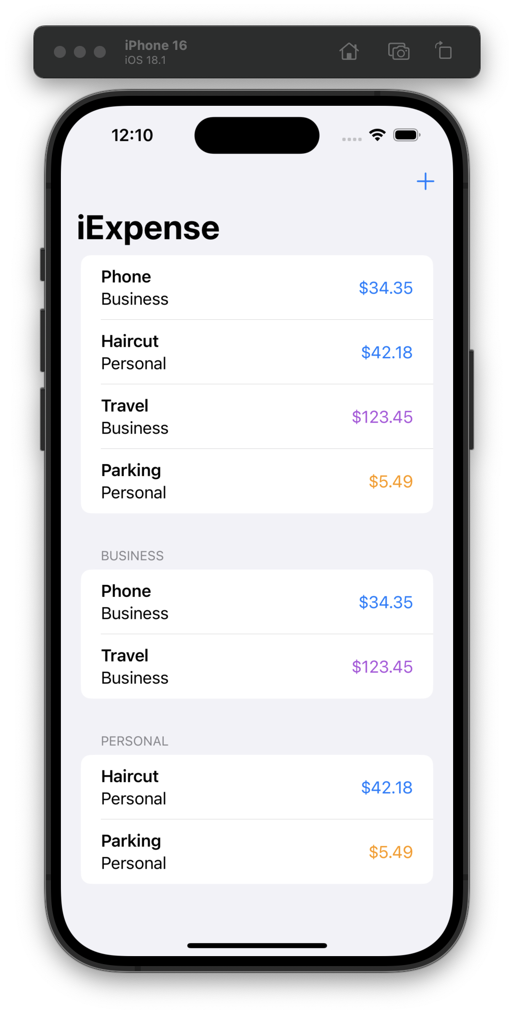
Day 38 included a quiz and some prompts for us to add features on our own to the app, which included coloring the expense amounts and adding the separate Business/Personal sections (while still keeping support for deleting expenses in those new sections)! #100DaysOfSwiftUI
I got my flu shot and COVID booster yesterday morning and paid for it with fever dreams last night. I have always had a strong reaction to the COVID vaccine.
Day 37, using the APIs we learned yesterday in a new app, but this stood out to me (emphasis mine):
First, we need to decide what an expense is – what do we want it to store? In this instance it will be three things: the name of the item, whether it’s business or personal, and its cost as a
Double.
In a real app, you should almost always keep prices as integers so math with them is accurate.
As a training creator, I know there’s a trade-off between having “production-ready” code vs. simplifying it for learning.
This is a case where I would have made a different decision. #100DaysOfSwiftUI
Day 36 is the start of a new project, and thus a day of learning new APIs: @Observable with class, .sheet(), @Environment, .onDelete(), UserDefaults / @AppStorage, Codable, and JSONEncoder.
I would’ve liked more info about @Environment but I’m sure we’ll get into it more soon. #100DaysOfSwiftUI
I finished the Day 35 challenge today. It’s been a while since I’ve been “challenged” when programming, so this was a great reminder to stay humble while learning something new. #100DaysOfSwiftUI
Yesterday I looked at the Day 35 challenge (build a new app from just a description, no code) and I was like “nope, don’t have the energy today.”
I worked on it for ~45 minutes tonight and started off strong, but I’ve run into some errors that I’ll have to come back to tomorrow. #100DaysOfSwiftUI
Day 34 was a quiz and challenge day where we went back to one of our previous projects and added animations on our own. I really liked the challenge because I wasn’t expecting to go back to a previous project! #100DaysOfSwiftUI