WWDC 2025
Some quick notes from watching the keynote today:
- Awesome that Apple is opening up the on device model—before today, it felt like they would only do this in very controlled ways.
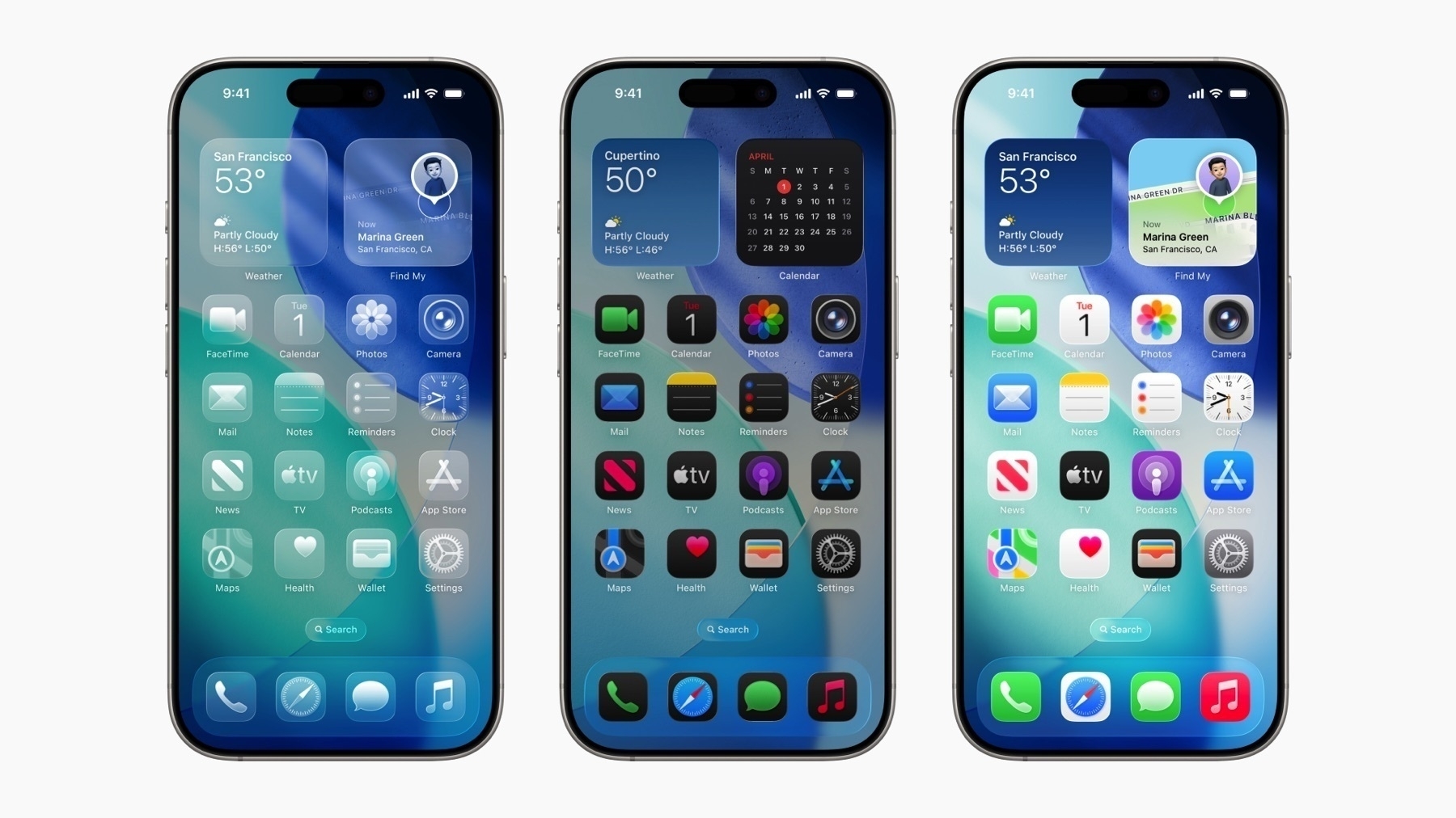
- The glass in some elements (like tab bars) looks like way too much (not enough contrast with the background elements), so I’ll bet $5 that the translucency gets turned down over the summer.
- The “selected” state for tab bar items looks awful.
- The all-clear look for icons looks over the top but cool.
- I’m excited that parts of the UI changing based on the device movement/accelerometer is back. Those seemed to go away over time since the iOS 7 days, but I think they’re great little bits of interactivity.
- I had no idea that typing indicators in group chats weren’t a thing… guess I’m not in that many group chats.
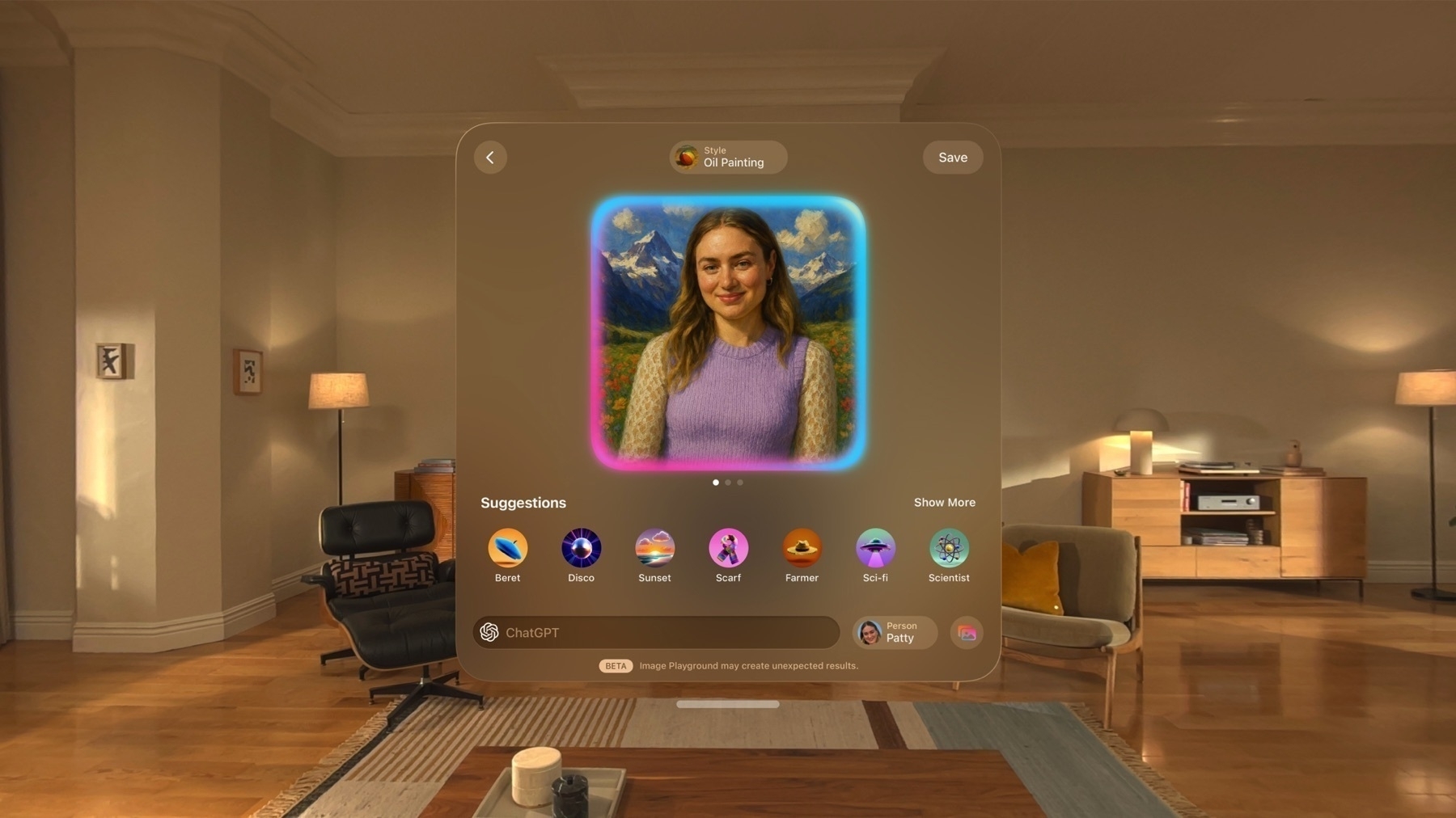
- Surprised they more deeply integrated ChatGPT with the image styles; I thought they would keep an arm’s distance from integrating more with OpenAI.
- FaceTime translation is awesome. I’m surprised they didn’t do the translation in the same voice as the speaker. Maybe that would be too creepy or require too much processing power.
- It seems like the best Liquid Glass UIs are when the text is light over a dark background. Hopefully they improve the readability across the board.
- The movement under Liquid Glass when content is playing (like video, Apple TV, etc.) makes all the buttons move and it looks distracting to me. I’m curious to see it in practice.
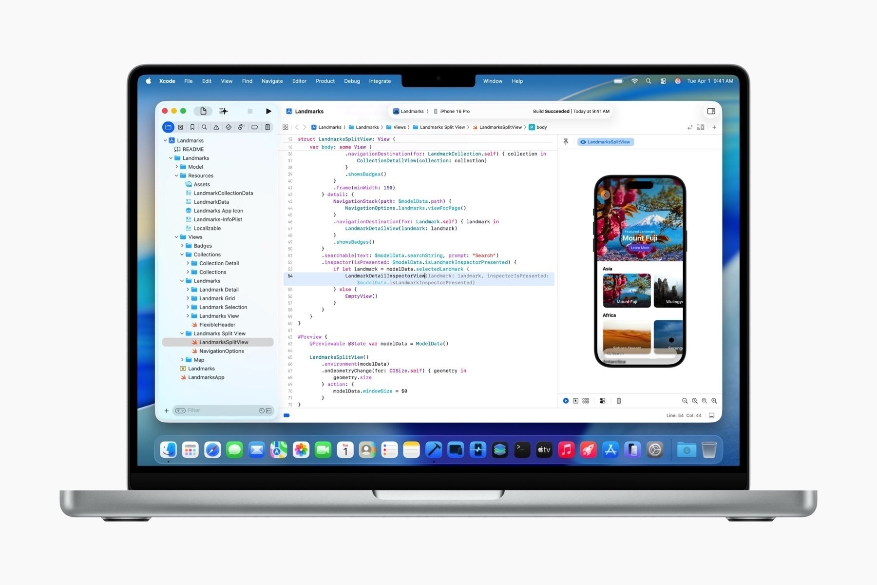
- Not sure how I feel about the new macOS design, especially the sidebar. Why does it look raised?
- The macOS toolbar looks a lot better with contrast between the button shapes and the toolbar’s background.
- Clipboard history on macOS! It’s always been on my to-do list to try a clipboard manager, but now I’ll just wait for Tahoe.
- Spatial widgets in visionOS are amazing. I had so many app ideas before the hardware was released that were based on physical persistence. Now it seems like this is possible!
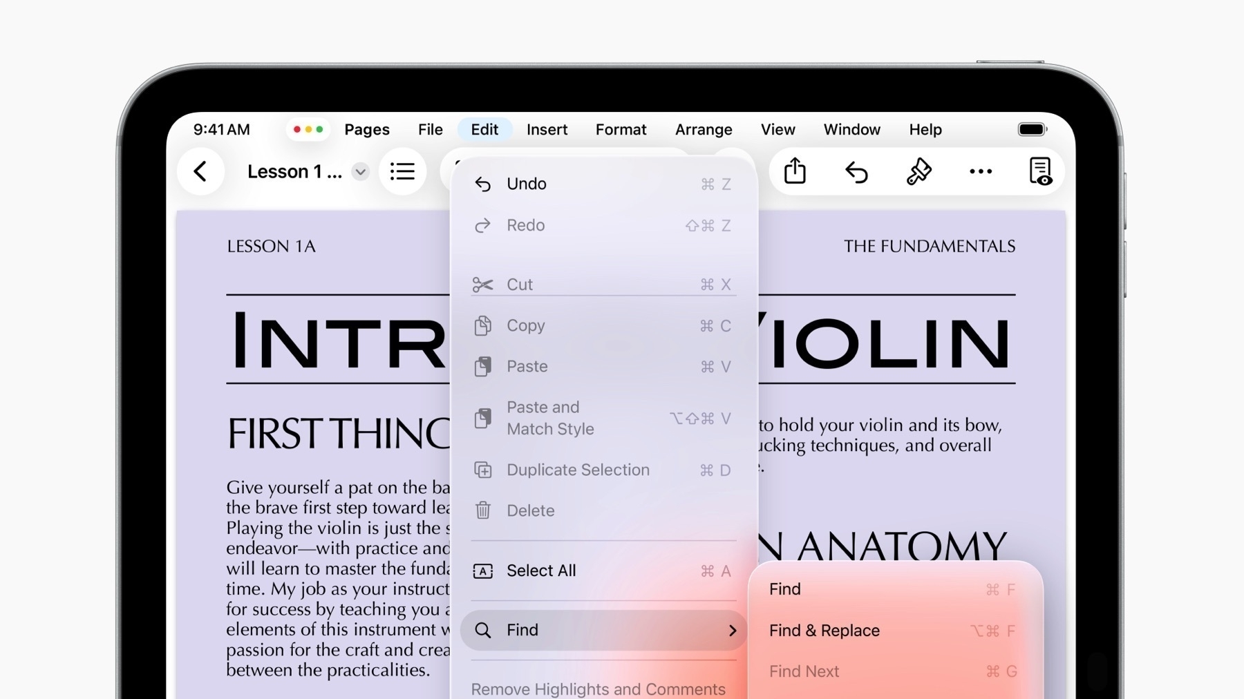
- Wow, they really brought the macOS window traffic light widgets to iPadOS. And now the design changes on macOS makes sense (they’re consistent with each other).
- Wow, and the menu bar is on iPadOS now? Awesome.
- lol @ “We’ve expanded our vision for Swift Assist.”
- I liked the little movie at the end.
Images courtesy of Apple.


