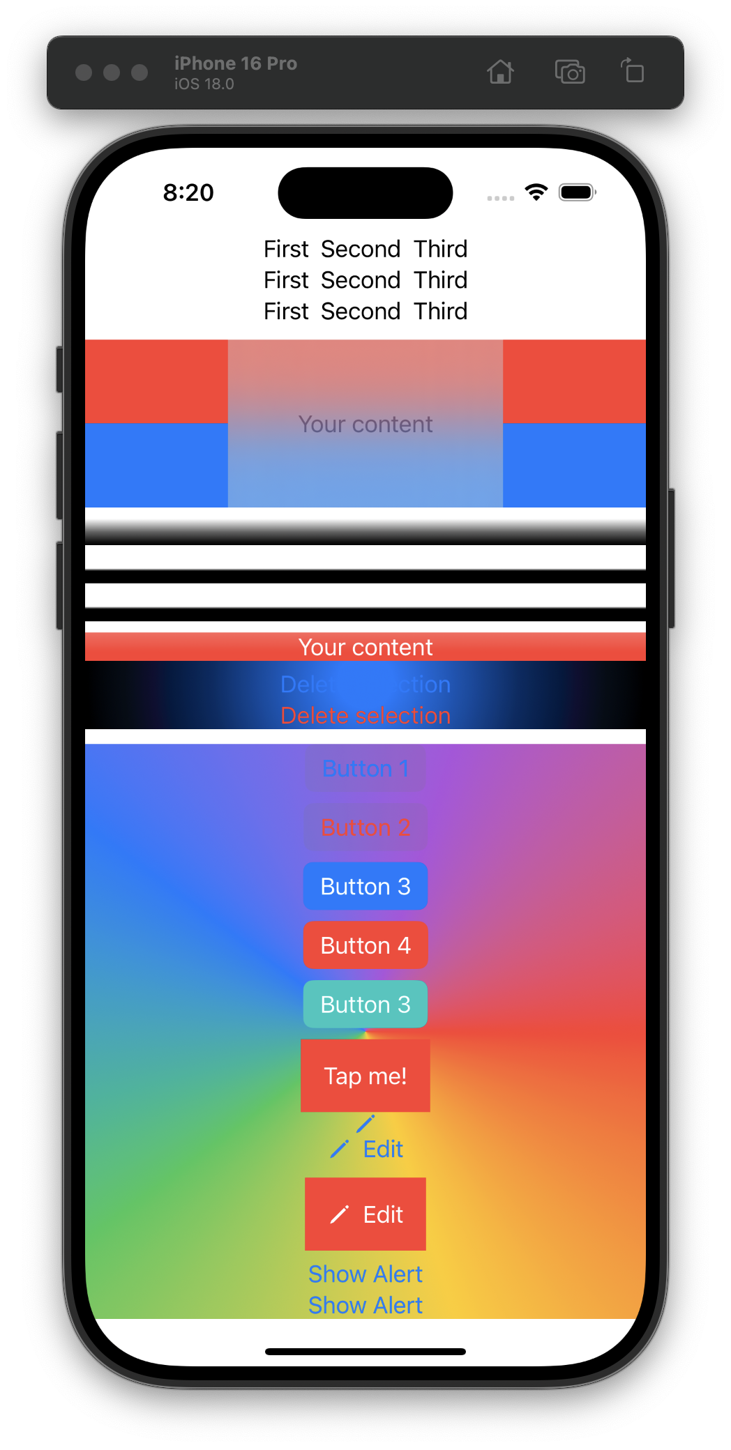
Day 20 is all about stacks, gradients, buttons, and images. I find it more fun to keep all the sample code in one project and let it pile up. 🤪 #100DaysOfSwiftUI

Day 20 is all about stacks, gradients, buttons, and images. I find it more fun to keep all the sample code in one project and let it pile up. 🤪 #100DaysOfSwiftUI
